

UX DESIGN
Disclaimer: All examples are taken from actual projects and work created by me for the purposes of the clients’ projects.

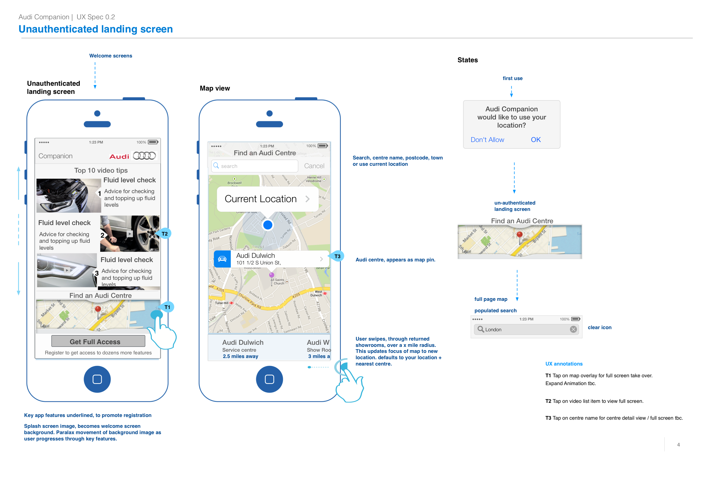


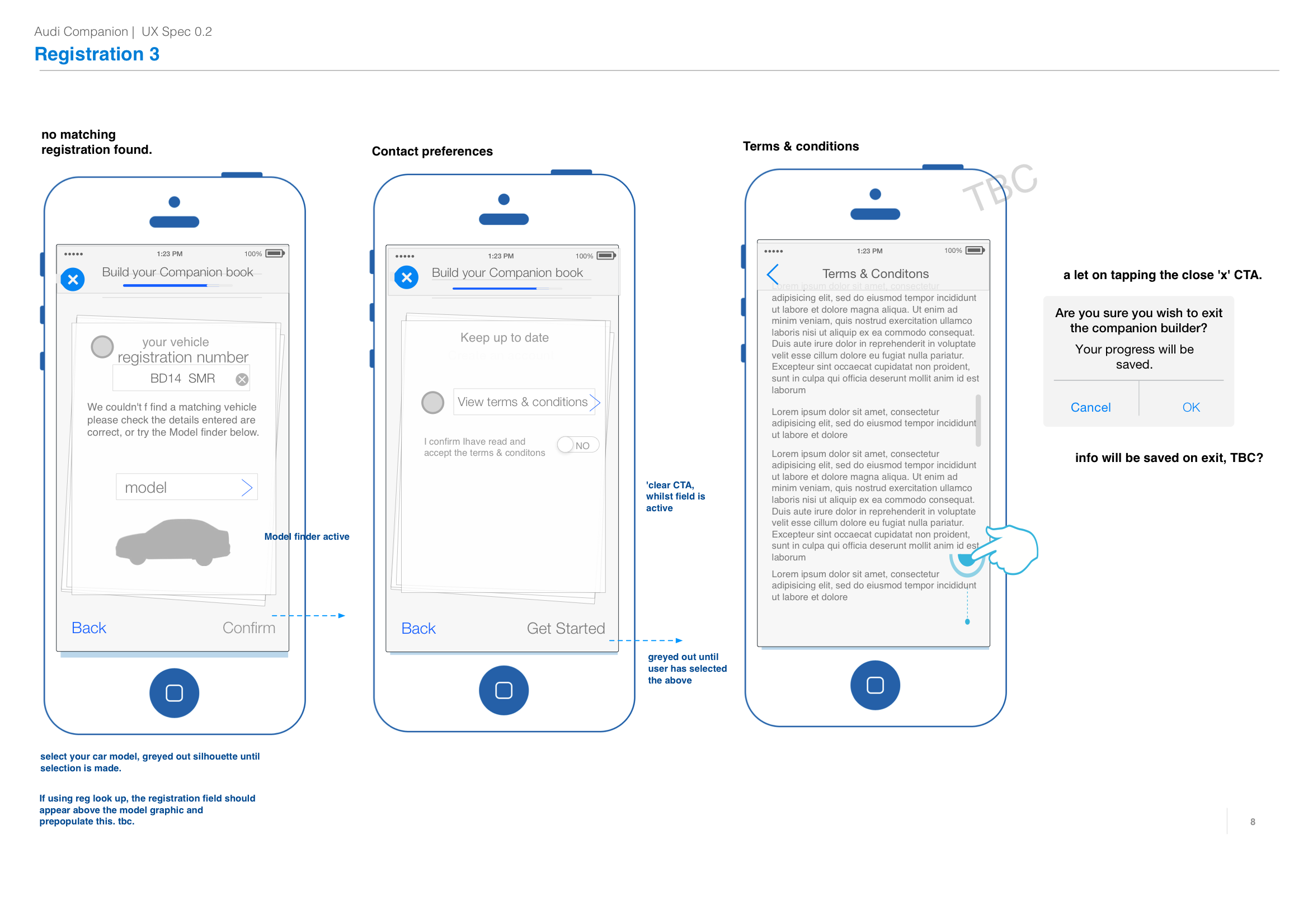


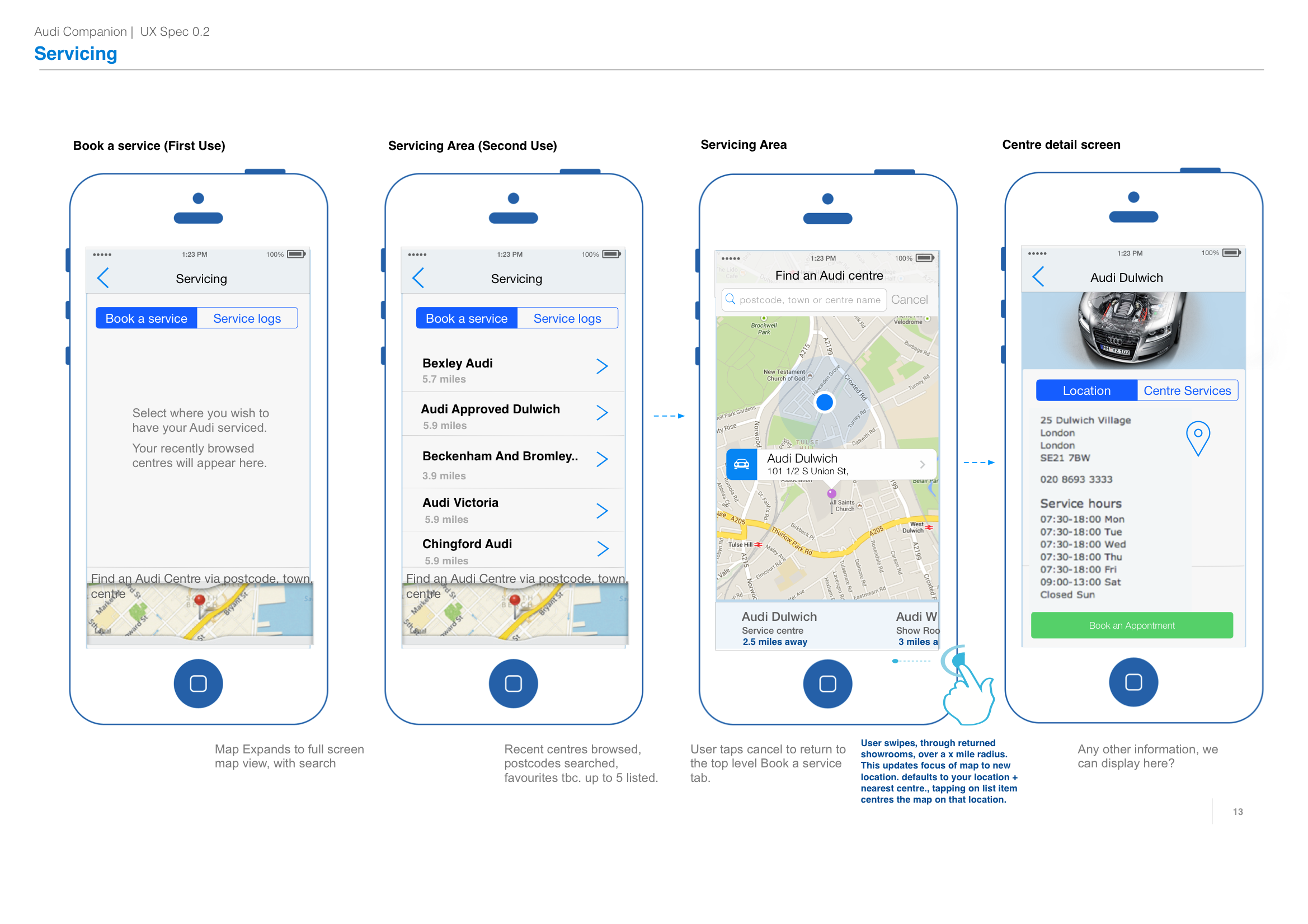
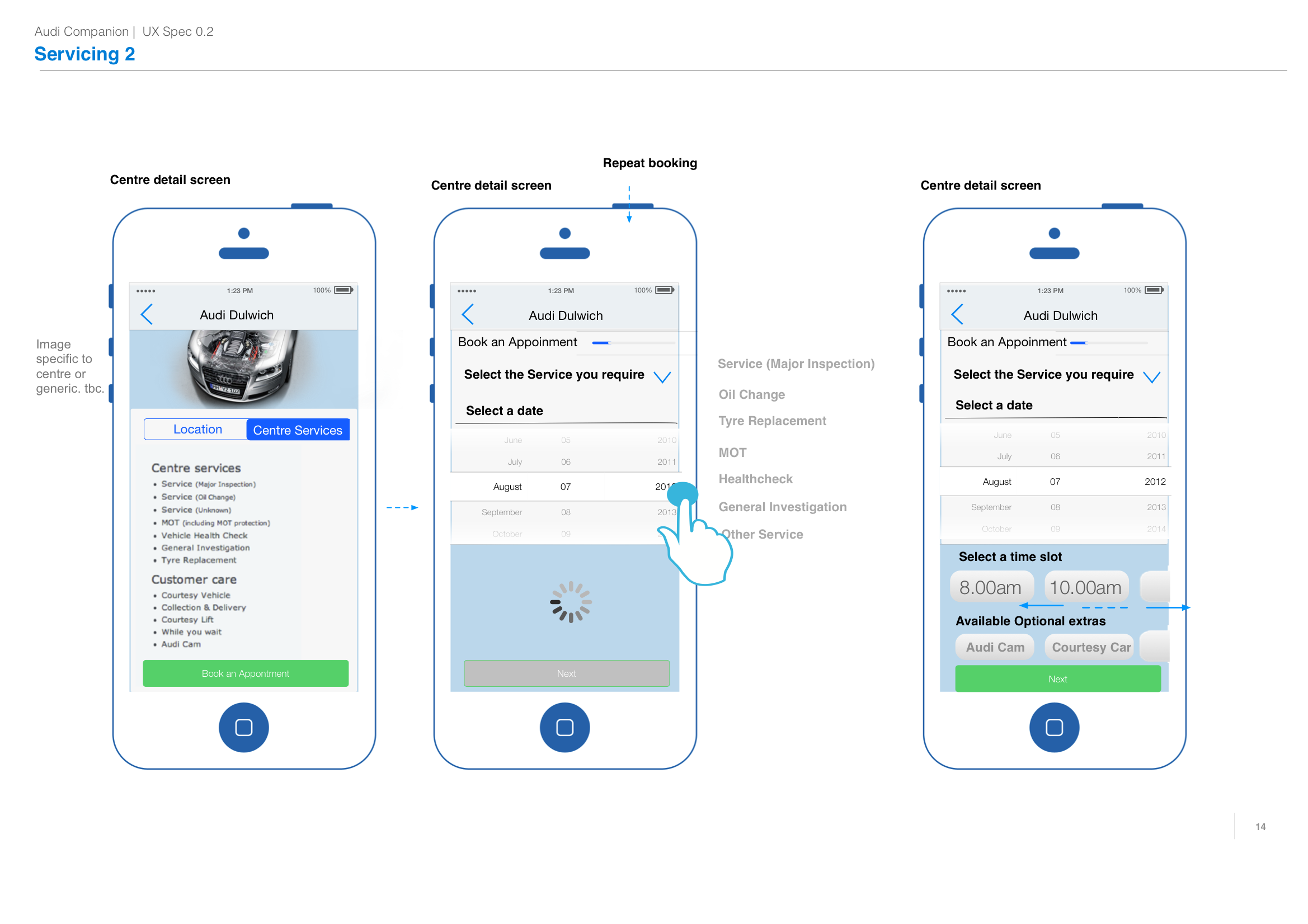
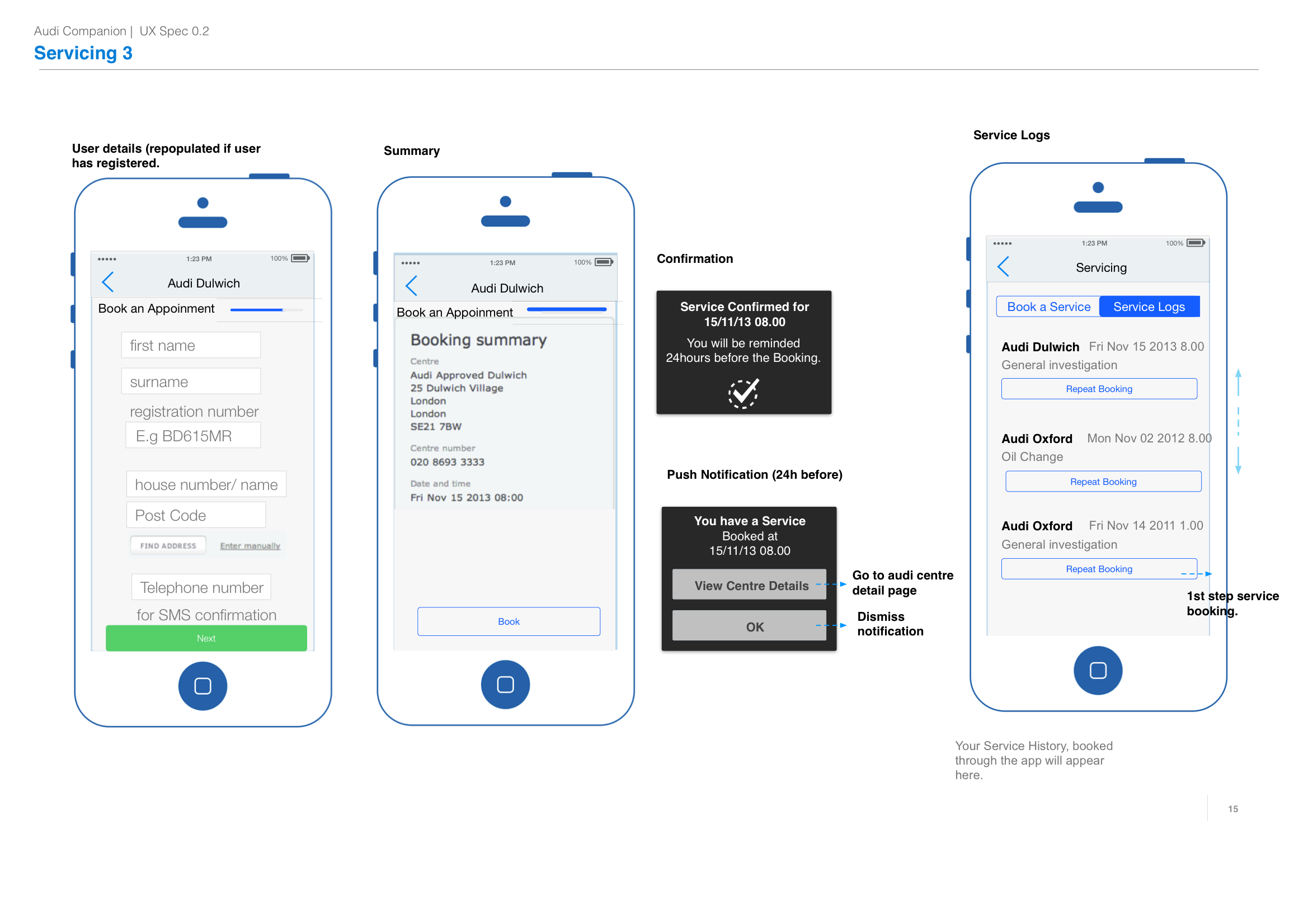

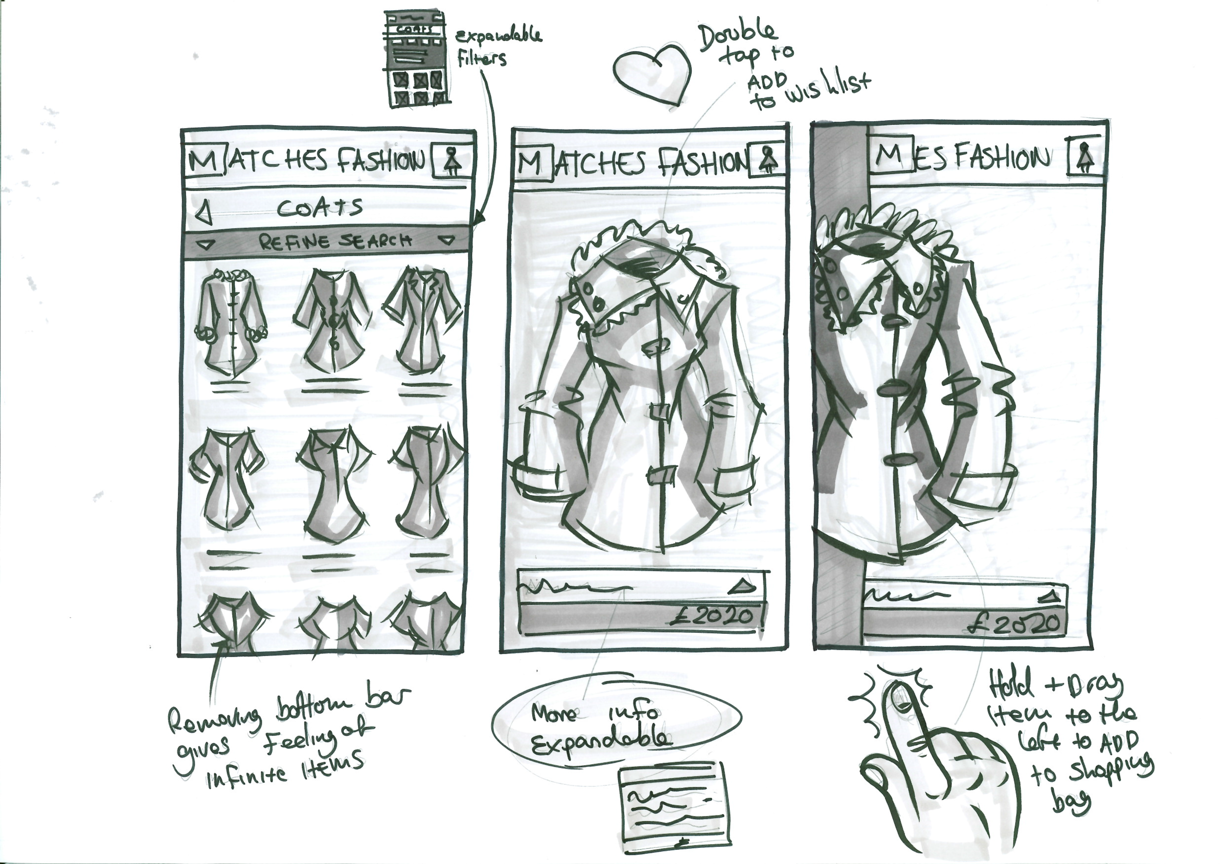
Example 1 - Flows & Interactions
During the process of defining the functional flows for Audi’s Connect app, we meticulously mapped out the user flows, detailing each stage in wireframe format. The wireframes included annotations to clearly indicate expected behaviours and conditionals. Additionally, specific behaviours for touch screen input were denoted, highlighting differences from the web experience, as this was a native mobile app.
It was crucial to specify any behaviors around hidden or pop-up menus, as well as changes triggered by device rotation, leveraging the mobile device’s gyroscope for alternative UI displays. All gestures, such as swipe, tap, pinch to zoom, or scroll, were clearly illustrated.
These detailed flow diagrams facilitated a clear understanding of concepts, enabling effective communication with team members and providing clear expectations for developers. This approach proved especially useful during early-stage user testing, ensuring that all interactions were thoroughly planned and tested.


Example 2 - Responsive Web
When designing for modern web devices, it’s critical to understand the different behaviors of the components that will be displayed on a page. There are two primary approaches:
1. True Responsive Design: In this approach, all information, components, and views wrap, cascade down, and shrink to fit within tablet and mobile devices while maintaining the layout offered in larger views.
2. Adaptive Responsive Design: Here, components and information adapt and change what is displayed and how it is displayed for each viewport size, allowing for an always optimal solution.
When outlining responsive web content on a column grid, it’s essential to plan how components will behave across various viewports. The images on the left illustrate examples of using a grid to plan component behavior. Key considerations include:
• Grid Layout: Define a grid layout that can flexibly adjust across different screen sizes.
• Components Behavior: Plan how complex components like forms, charts, tables, and interactive elements will react within the grid. For instance, forms may stack fields vertically on smaller screens, while charts and tables might simplify or offer scrollable views.
• Responsive Patterns: Use common responsive patterns such as hiding non-essential elements on smaller screens, collapsing navigation menus, or using accordion panels for detailed content.
By clearly outlining these behaviors in wireframes and annotations, designers can ensure a seamless experience across all devices. This approach not only aids in the initial design phase but also provides developers with a clear guide, ensuring consistent implementation.


Example 3 - Functional & User Flows
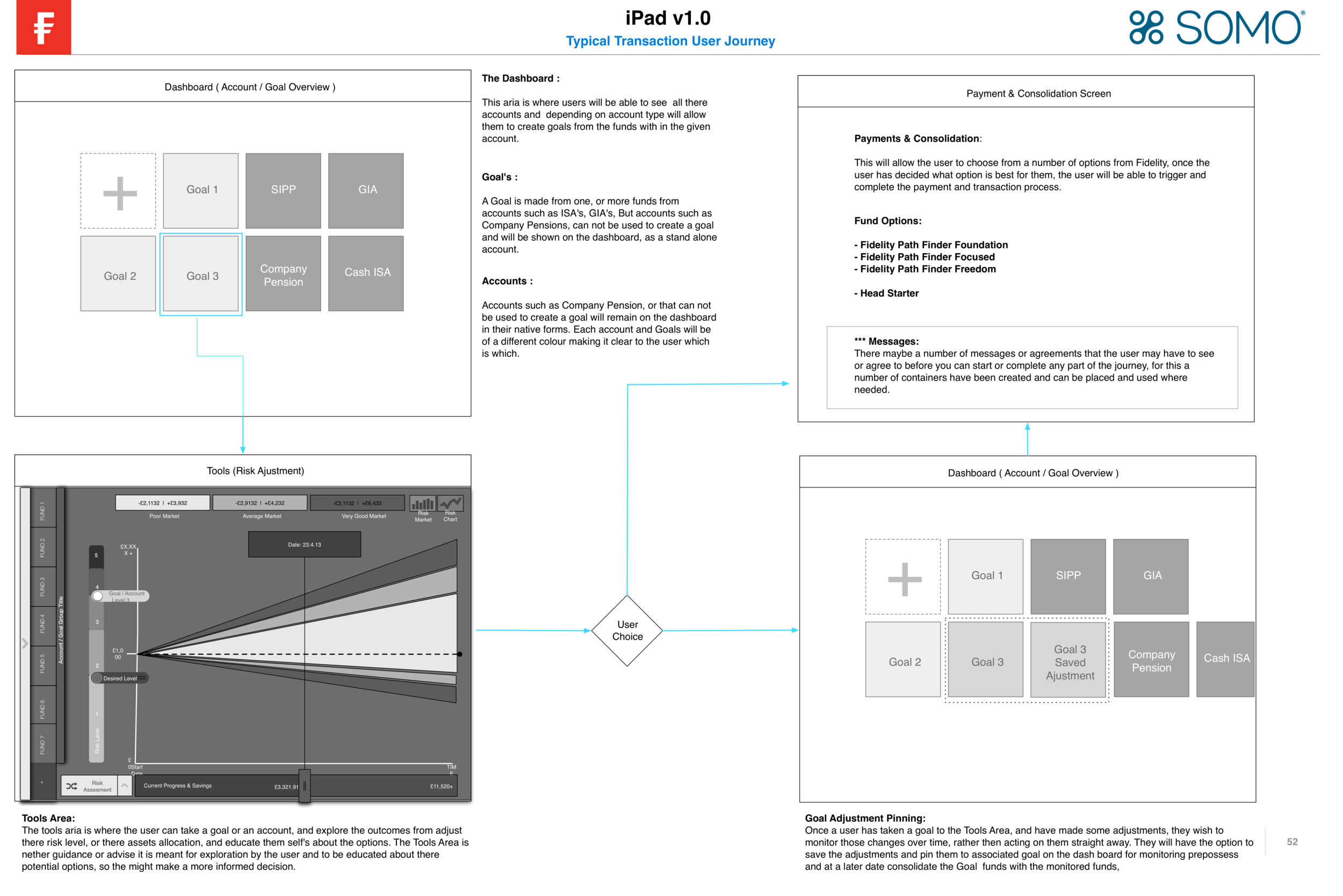
The following examples illustrate different types of user and functional flows that need to be diagrammed to explain how behaviors work or how users navigate through an app or website. These diagrams differ from interaction flows by showing the hidden logic or steps taken behind the scenes, such as during password failures or registration processes that might not have a visible UI element.
For example, a user might see a spinner on the screen, but the functional flow diagram will detail the steps the app takes to authenticate with servers and what occurs if the authentication is approved or fails. These types of flows, like the example for an iPad from Fidelity, are crucial. While they don’t go into the same depth as architectural diagrams, they clearly show user-intended behavior.
Key Aspects of User and Functional Flows:
• User Flows: Diagram the routes and steps a user takes through an app or website, including all possible interactions and decision points.
• Functional Flows: Highlight the hidden steps and logic, such as server communications, error handling, and backend processes.
• Conditional Logic: Show different paths based on conditions, such as what happens when a user enters incorrect login information.
• State Changes: Illustrate changes in the app’s state, such as loading indicators, success messages, or error alerts.
By detailing these flows in diagram format, designers can effectively communicate the intended behavior to development teams, ensuring a clear understanding of both visible and hidden processes. This approach is particularly useful during early-stage user testing and for aligning team members on the functionality and user experience.


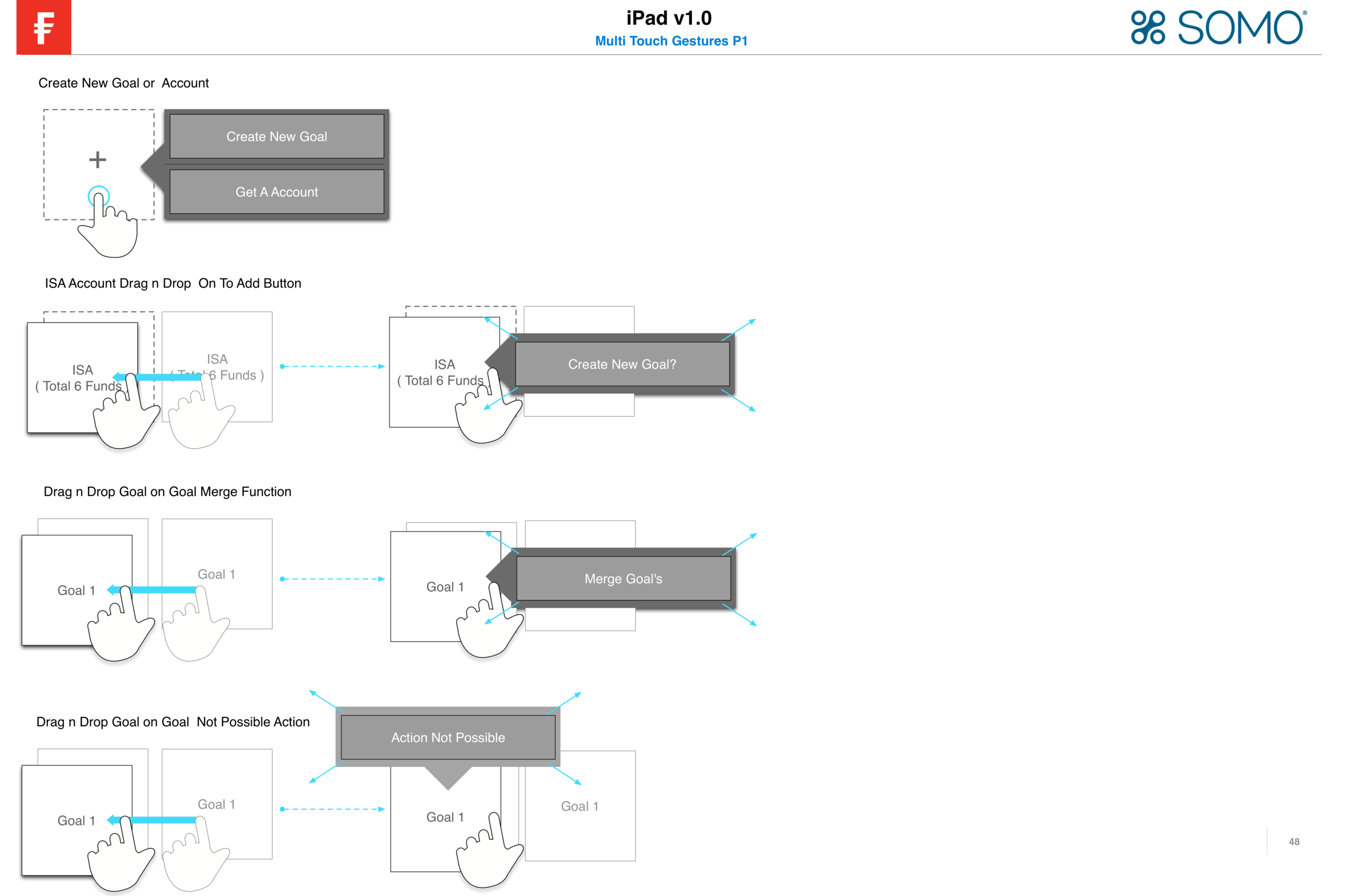
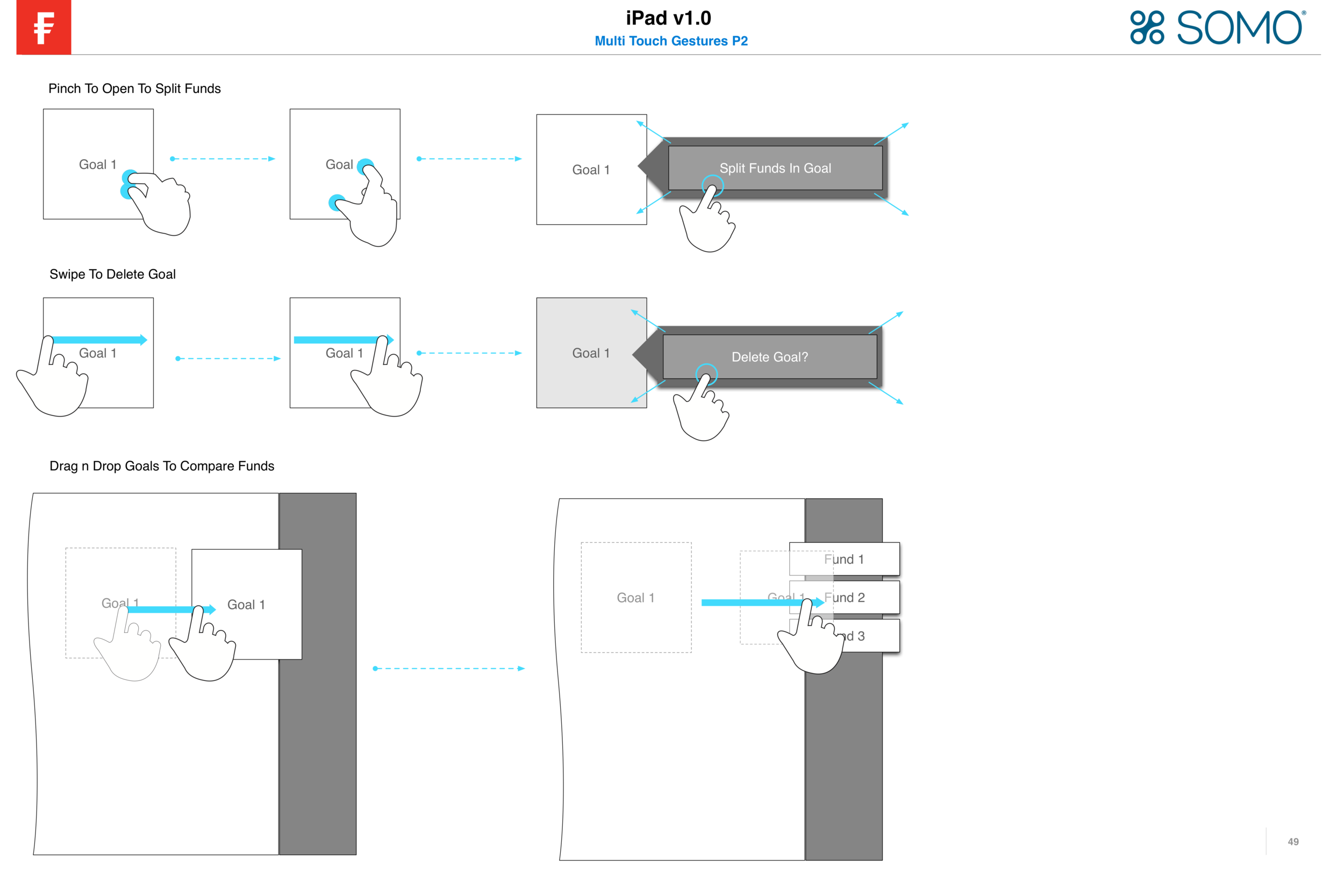
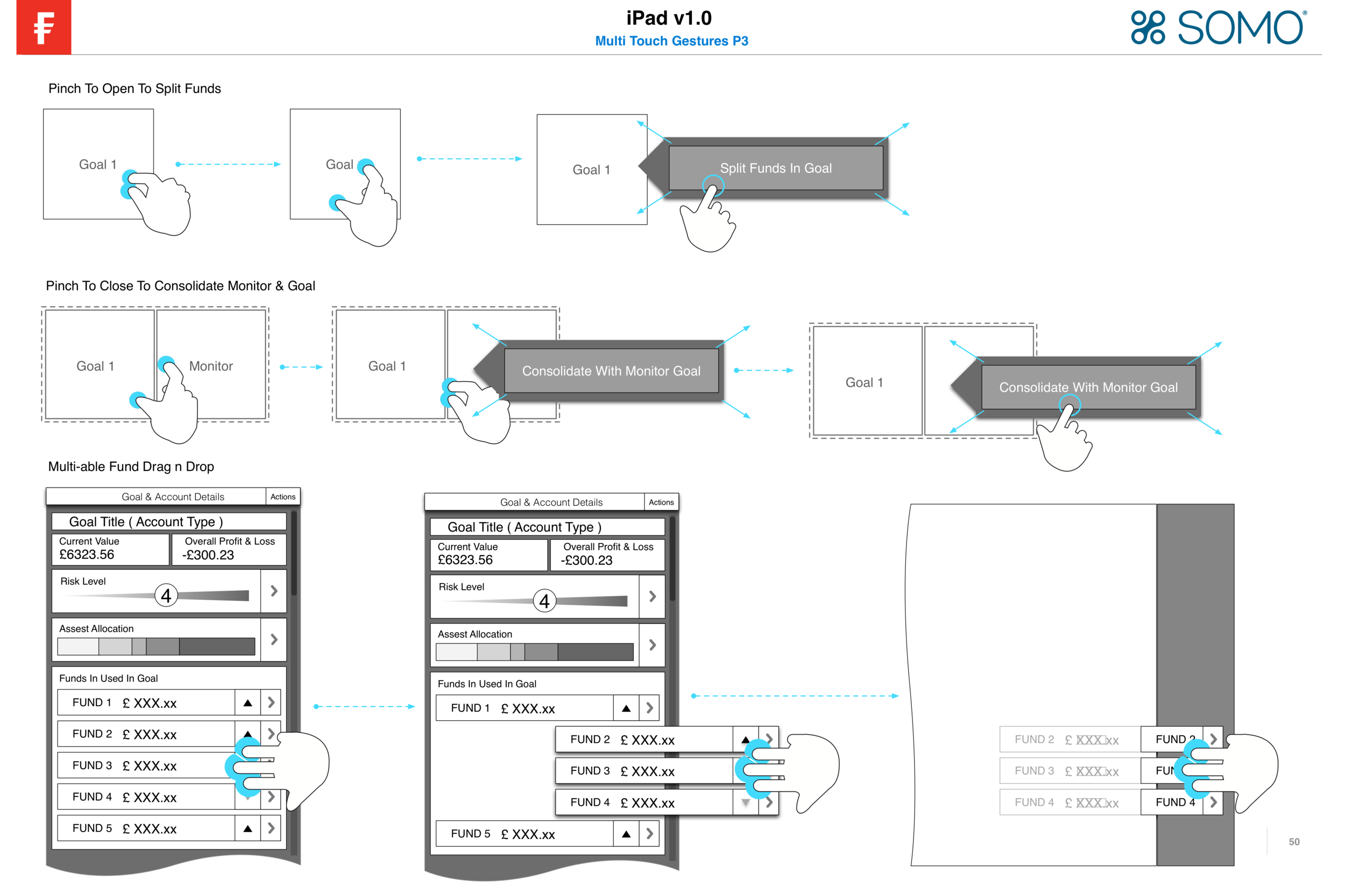
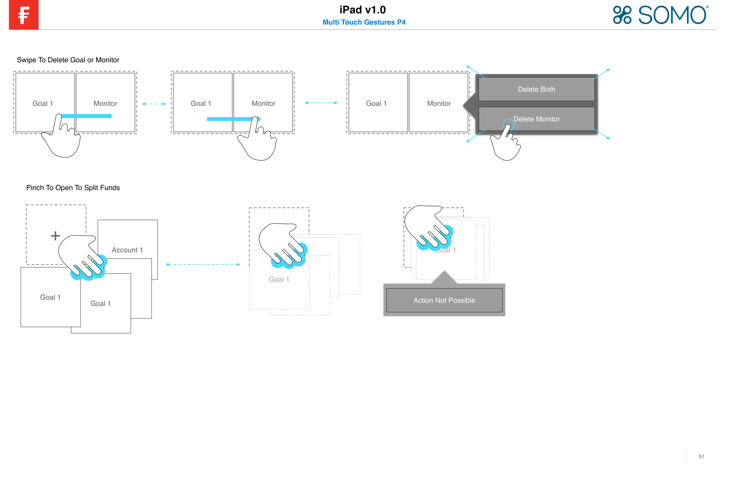


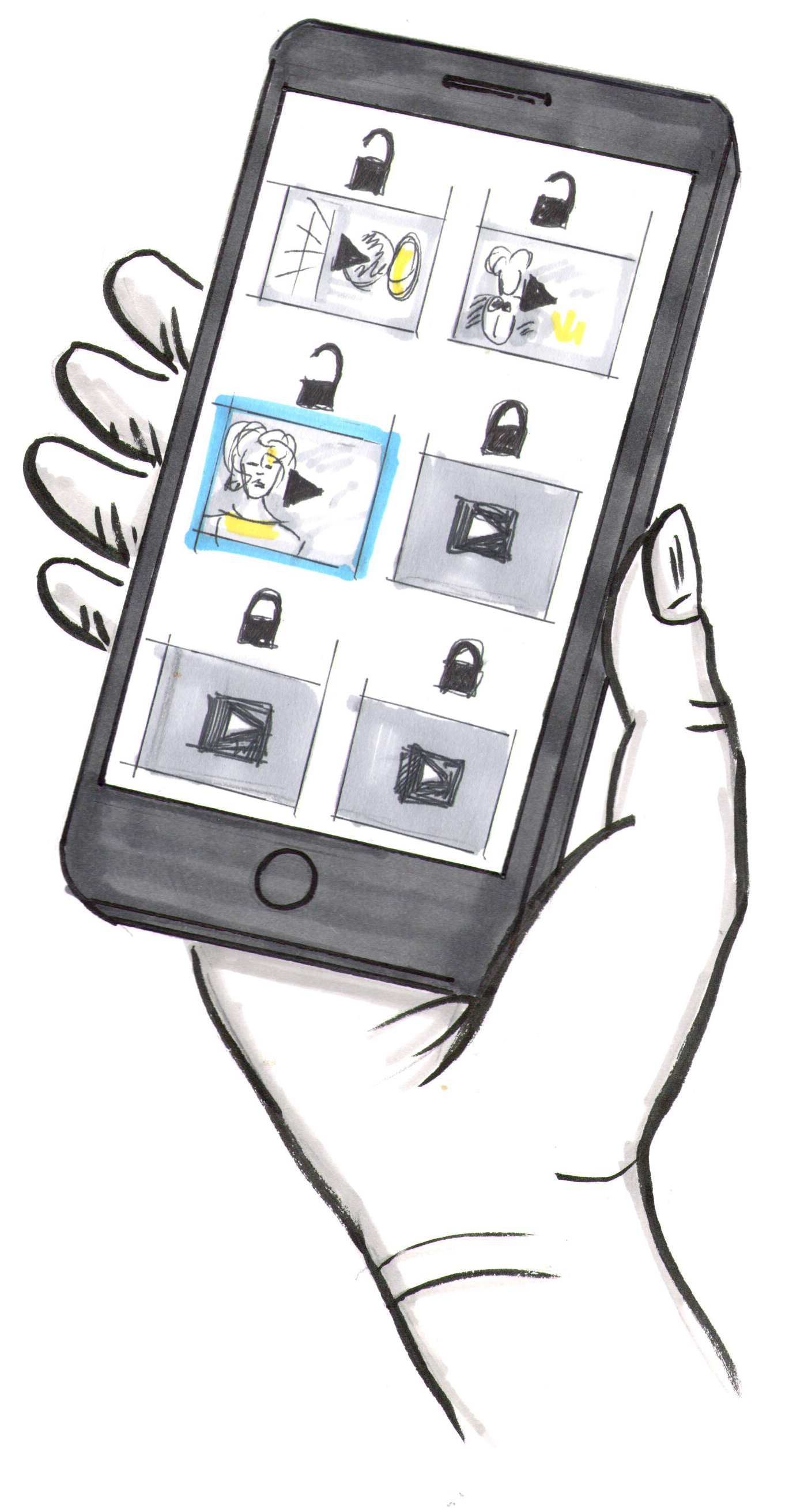
Example 4 - Multi Touch Interactions
The following examples illustrate how UX wireframes can be used to show multi-touch interactions and multi-finger functionality on devices such as iPads and phones. These wireframes are essential for detailing how users will interact with the app through gestures like pinching, swiping, and tapping with multiple fingers.
Key Aspects of Multi-Touch Interaction Wireframes:
• Gesture Mapping: Clearly illustrate different multi-touch gestures, such as pinch-to-zoom, two-finger swipes, and three-finger taps. Each gesture should be represented visually to show how it affects the UI.
• User Feedback: Detail the visual feedback provided to users for each gesture, such as zooming in on a map or rotating an image. This helps in understanding how the app responds to multi-touch inputs.
• Hidden Interactions: Include any hidden interactions or secondary actions that occur with multi-touch gestures. For example, a two-finger swipe might trigger a different action than a single-finger swipe.
• Contextual Behavior: Show how gestures behave differently in various contexts within the app. For instance, pinching to zoom might work differently in a photo gallery compared to a map view.
• Error Handling: Outline what happens if a gesture is not recognized or if there is an error. This includes visual cues and alternative actions to guide the user.
By using wireframes to map out these interactions, designers can ensure that multi-touch functionality is intuitive and responsive. These detailed wireframes serve as a valuable communication tool for developers, ensuring that the multi-touch interactions are implemented accurately and provide a seamless user experience. This approach is particularly beneficial during user testing phases, allowing for adjustments based on real user feedback.


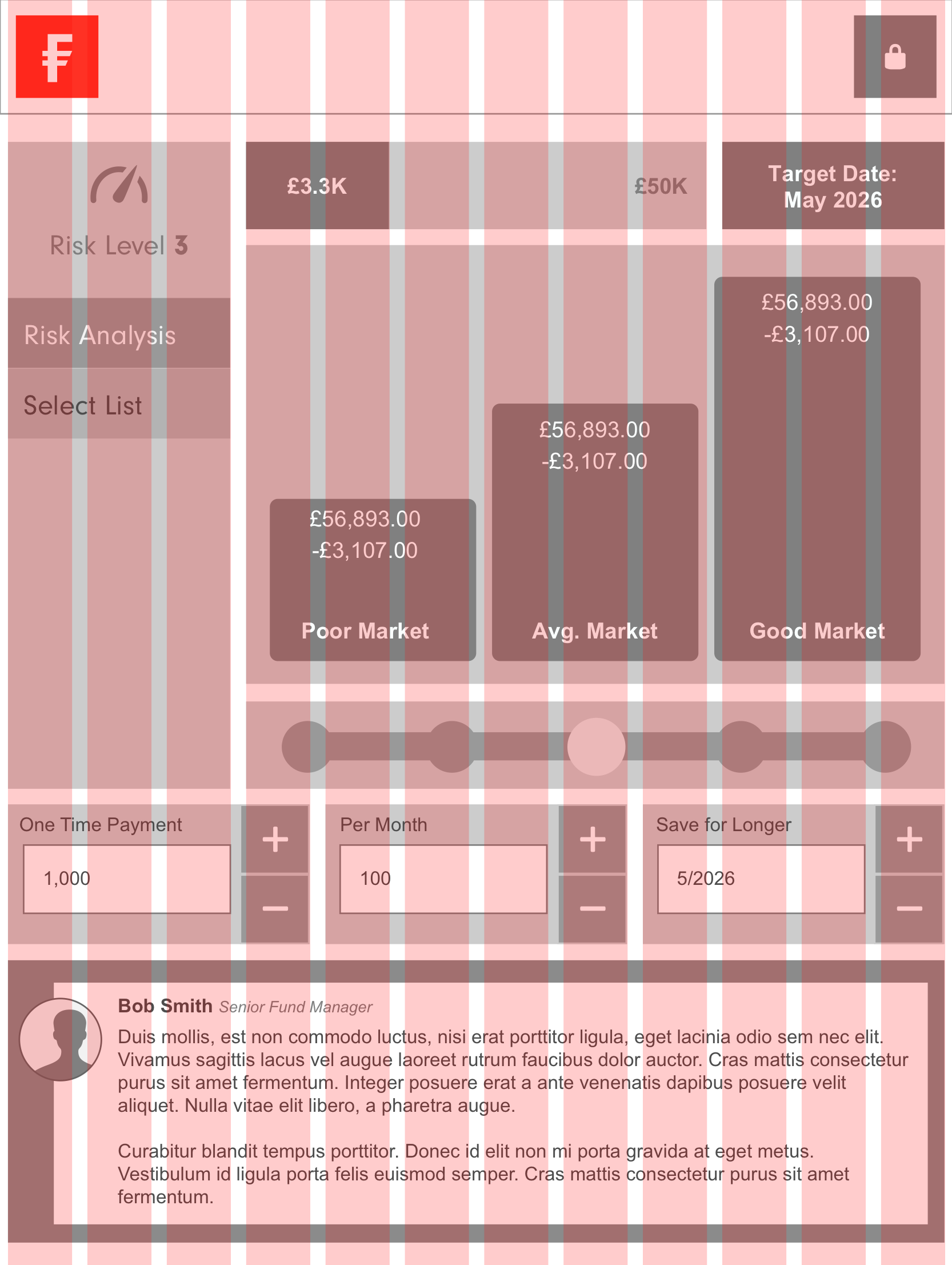
EXAMPLE 5 - Complex Data Annotations
The following examples demonstrate UX annotations on wireframes for displaying and interacting with complex data and charts, as seen in the Fidelity iPad app. These wireframes illustrate how funds and stocks might be displayed and how users can interact with this data.
Key Aspects of UX Annotations for Complex Data:
• Data Visualization: Clearly annotate the wireframes to show how data will be visualized, including charts, graphs, and tables. This includes specifying the types of charts (e.g., line charts, bar graphs, pie charts) and how data points will be plotted.
• Interactive Elements: Detail the interactive elements within the charts, such as tooltips, hover states, and clickable data points. Annotate how users can tap on a data point to see more details or drag to zoom into a specific time period.
• User Interactions: Describe the interactions users can have with the data, such as filtering, sorting, and comparing different datasets. Include annotations for multi-touch gestures like pinching to zoom in on a chart or swiping to scroll through data.
• Dynamic Updates: Indicate how real-time data updates will be handled, ensuring that users see the most current information. Annotations should describe how the interface will respond to new data, such as animations or highlights to draw attention to changes.
• Contextual Information: Provide annotations for any contextual information that accompanies the data, such as legends, labels, and explanatory text. This helps users understand the data they are viewing and how to interpret it.
• Error Handling: Outline what happens if data fails to load or an error occurs. This includes visual cues like error messages or placeholder content to inform users of the issue.
By annotating wireframes with these details, designers can create a comprehensive guide that ensures complex data and chart interactions are intuitive and user-friendly. These annotations are crucial for communicating the intended functionality to developers, ensuring accurate implementation. This approach is particularly useful for applications like the Fidelity iPad app, where users need to interact with financial data in meaningful and actionable ways.


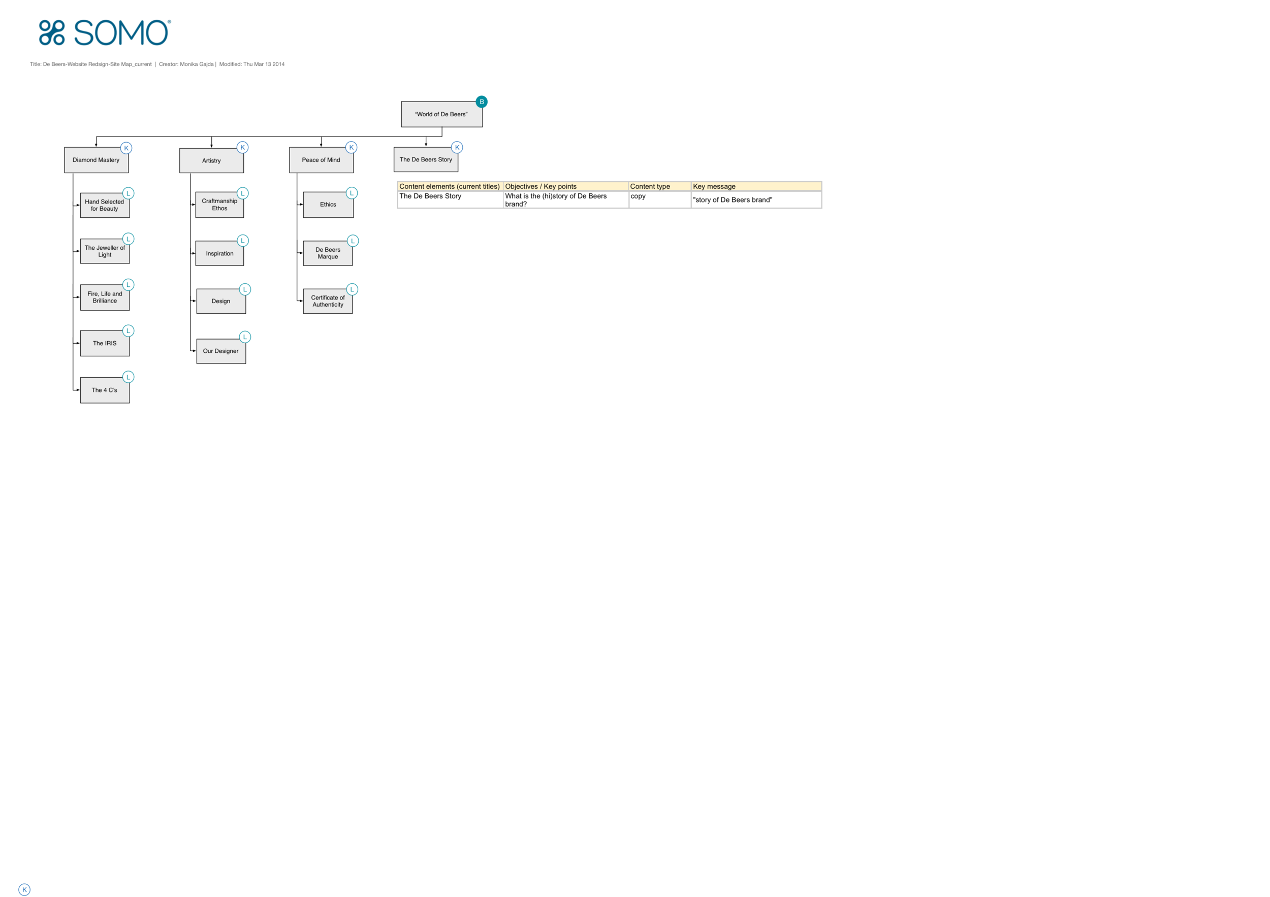
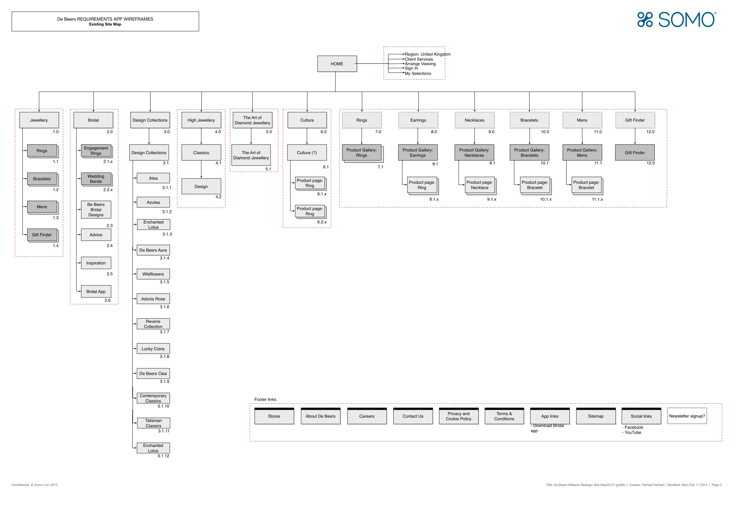
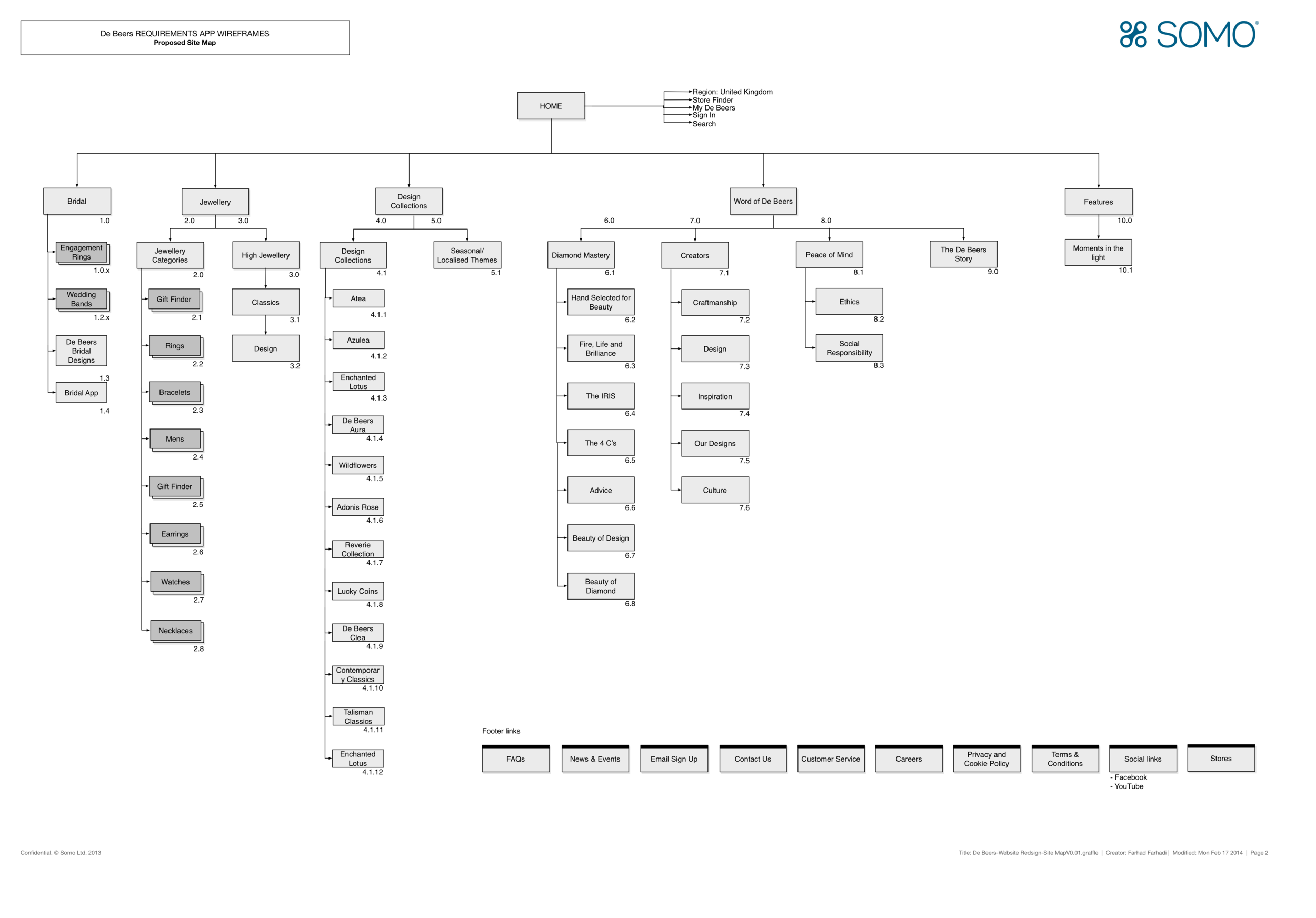
Example 6 - Site maps
These examples show how UX detailed site maps are created and their purpose for large organizational sites like banks.
Creating UX Detailed Site Maps:
• Purpose: Outline the website’s structure and hierarchy, aiding in content planning.
Process:
• Content Inventory: List all content and pages.
• Hierarchical Structure: Organize content clearly.
• Navigation Paths: Define navigation routes.
• Annotations: Detail each page’s functionality.
Key Aspects of Detailed Site Maps:
• Overview: Show the site’s full structure.
• User Flows: Illustrate navigation paths.
• Interaction Points: Highlight critical points like login pages.
• Scalability: Allow for future growth.
• Stakeholder Communication: Align with stakeholders before development.
Examples for a Bank’s Site Map:
• Main Sections: Home, Personal Banking, Business Banking, Wealth Management, Loans, Credit Cards, Customer Support, About Us.
• Sub-Sections:
• Personal Banking: Accounts, Savings, Investments, Online Banking, Mobile Banking.
• Business Banking: Small Business, Corporate Banking, Merchant Services.
• Wealth Management: Investment Services, Financial Planning, Retirement Accounts.
• User Flows:
• Account Setup: Home > Personal Banking > Accounts > Open an Account.
• Loan Application: Home > Loans > Apply for a Loan.
• Customer Support: Home > Customer Support > Contact Us.
Detailed site maps ensure a well-organized structure that meets user and organizational needs, crucial for large sites like banks. They aid in planning, communication, and delivering a seamless user experience.


Example 7 - Persona Journey Maps
UX persona journey maps illustrate the behaviors and experiences of different user personas as they interact with a product or service. These maps are essential for helping UX, development, and business teams understand user needs and behaviors.
Key Benefits:
• User Insights: Provide a deep understanding of user behaviors, motivations, and pain points, offering a comprehensive view of the user experience.
• Design Guidance: Inform design decisions to create user-centered products, ensuring that the design aligns with user expectations and needs.
• Team Alignment: Ensure that all teams have a shared understanding of user goals and experiences, fostering collaboration and consistency across departments.
• Improvement Areas: Identify opportunities to enhance user satisfaction and engagement, highlighting areas where the user experience can be improved.
How They Help:
• Visual Representation: Clearly map out each step of the user’s interaction with the product, from initial contact through to final engagement.
• Empathy Building: Help teams empathize with users by illustrating their journeys and highlighting emotional highs and lows.
• Strategic Planning: Support strategic planning by identifying critical touchpoints and potential barriers, guiding the development of more effective solutions.
By visualizing the user’s journey, these maps enable teams to tailor solutions that meet real user needs, leading to better product outcomes and higher user satisfaction.


Exmaple 8 - User Personas
User personas are fictional characters created to represent different user types that might use a product, service, or website. They are based on user research and real data about user behaviors and demographics.
Creating User Personas:
1. Research: Collect data through user interviews, surveys, and analytics. This includes demographics, motivations, goals, behaviors, and pain points.
2. Segmentation: Group users into distinct segments based on similarities in their data.
3. Persona Development: Create detailed profiles for each segment, including name, background, characteristics, needs, goals, and challenges.
4. Validation: Ensure personas are validated by cross-referencing with additional data or user feedback to confirm accuracy.
Purpose of User Personas:
1. Understanding Users: Provide a clear and detailed understanding of different user types, helping teams empathize with users.
2. Design Focus: Guide design decisions by focusing on user needs and preferences, ensuring that the product is user-centered.
3. Alignment: Align the entire team, from UX designers to developers and stakeholders, around a common understanding of the target audience.
4. Communication: Facilitate better communication about user needs and behaviors across the team.
How They Help the UX and Development Process:
1. User-Centered Design: Ensure that the design process is focused on real user needs, resulting in more effective and satisfying products.
2. Prioritization: Help prioritize features and functionalities that are most important to the target users.
3. Efficiency: Streamline decision-making by providing a clear reference for user preferences and behaviors.
4. Target Audience: Ensure that the product meets the needs of the intended audience, increasing the likelihood of success in the market.
5. Consistency: Maintain consistency in the user experience across different stages of development and iterations of the product.
By incorporating user personas into the UX and development process, teams can create products that truly resonate with users, addressing their specific needs and enhancing overall satisfaction. This approach helps in hitting the target audience effectively and ensures the product meets user expectations.


Example 9 - Scamps
Purpose of Scamps:
Scamps are quick, simple hand-drawn sketches used in the early stages of UX design to brainstorm and visualize ideas for page layouts and component placement. They serve as a preliminary step before creating more detailed wireframes and prototypes.
Creating Scamps:
1. Brainstorming: Quickly sketch out ideas for how a page or component might look and feel. This can be done individually or in collaborative sessions.
2. Layout Exploration: Experiment with different layouts and arrangements of components on the page, exploring various design possibilities.
3. Iterative Process: Create multiple scamps to explore a range of ideas and refine concepts through quick iterations.
4. Annotation: Add notes and annotations to the sketches to explain functionality, interactions, and design intentions.
Purpose and Benefits:
1. Idea Generation: Facilitate rapid brainstorming and idea generation, allowing designers to quickly visualize concepts.
2. Early Feedback: Gather early feedback from stakeholders and team members, helping to refine ideas before investing time in detailed wireframes.
3. Flexibility: Offer flexibility to explore a wide range of design options without the constraints of digital tools.
4. Cost-Effective: Save time and resources by addressing potential design issues early in the process.
How Scamps Help the UX Design Process:
1. Visual Communication: Provide a clear visual representation of ideas, making it easier to communicate concepts to the team and stakeholders.
2. User-Centered Design: Focus on the user experience by sketching out interactions and layouts that prioritize user needs and behaviors.
3. Foundation for Wireframes: Serve as the foundation for creating more detailed wireframes and prototypes, ensuring a smoother transition to digital design.
4. Collaboration: Encourage collaboration among team members, fostering a creative environment where ideas can be freely shared and refined.
By using scamps in the UX design process, designers can quickly and effectively explore and communicate ideas, ensuring that the final product meets user needs and expectations. This approach helps in creating intuitive and user-friendly layouts and interactions.


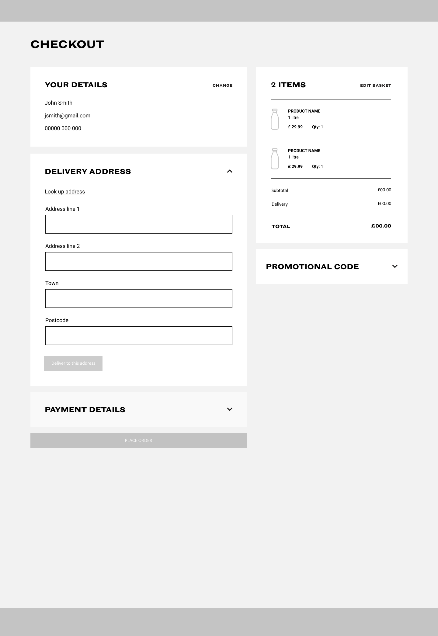

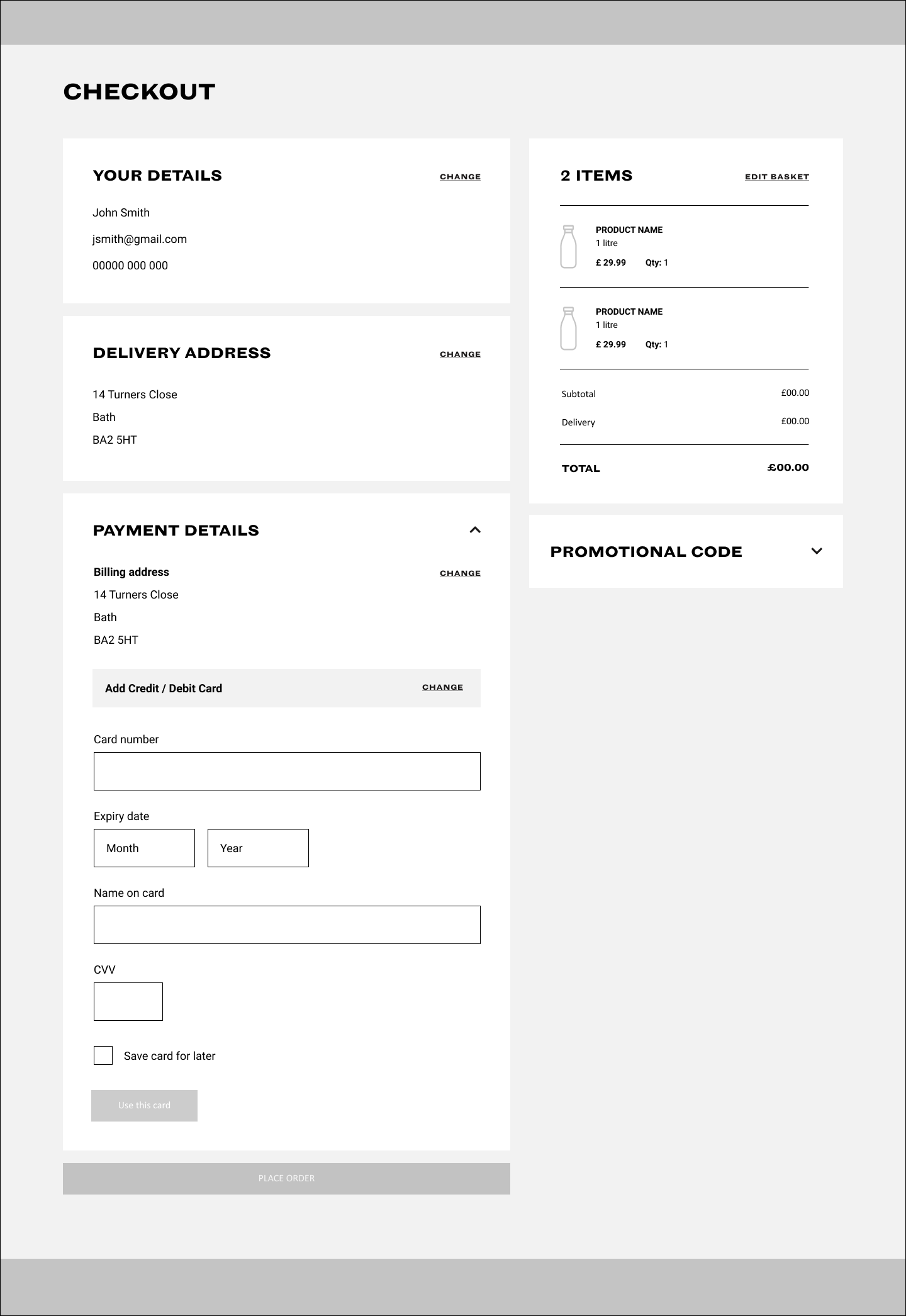

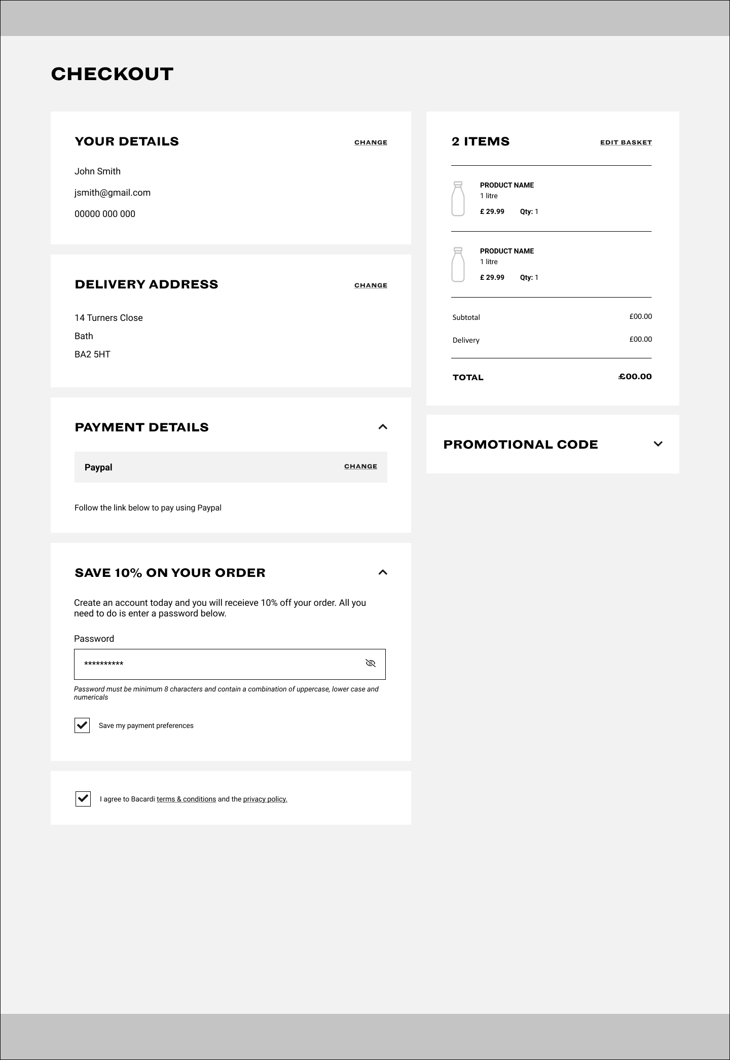
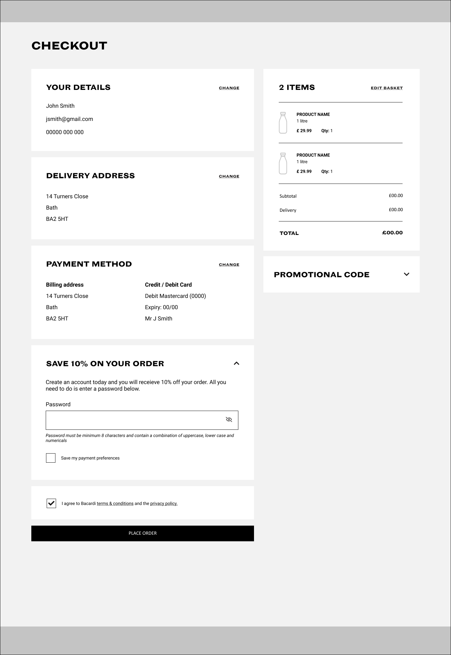


Example 10 - High Fidelity Wireframes
Purpose of Scamps:
Scamps are quick, simple hand-drawn sketches used in the early stages of UX design to brainstorm and visualize ideas for page layouts and component placement. They serve as a preliminary step before creating more detailed wireframes and prototypes.
Creating Scamps:
1. Brainstorming: Quickly sketch out ideas for how a page or component might look and feel. This can be done individually or in collaborative sessions.
2. Layout Exploration: Experiment with different layouts and arrangements of components on the page, exploring various design possibilities.
3. Iterative Process: Create multiple scamps to explore a range of ideas and refine concepts through quick iterations.
4. Annotation: Add notes and annotations to the sketches to explain functionality, interactions, and design intentions.
Purpose and Benefits:
1. Idea Generation: Facilitate rapid brainstorming and idea generation, allowing designers to quickly visualize concepts.
2. Early Feedback: Gather early feedback from stakeholders and team members, helping to refine ideas before investing time in detailed wireframes.
3. Flexibility: Offer flexibility to explore a wide range of design options without the constraints of digital tools.
4. Cost-Effective: Save time and resources by addressing potential design issues early in the process.
How Scamps Help the UX Design Process:
1. Visual Communication: Provide a clear visual representation of ideas, making it easier to communicate concepts to the team and stakeholders.
2. User-Centered Design: Focus on the user experience by sketching out interactions and layouts that prioritize user needs and behaviors.
3. Foundation for Wireframes: Serve as the foundation for creating more detailed wireframes and prototypes, ensuring a smoother transition to digital design.
4. Collaboration: Encourage collaboration among team members, fostering a creative environment where ideas can be freely shared and refined.
By using scamps in the UX design process, designers can quickly and effectively explore and communicate ideas, ensuring that the final product meets user needs and expectations. This approach helps in creating intuitive and user-friendly layouts and interactions.